
Thursday 31 December 2009
Wednesday 30 December 2009
Lastminute.com ideas

hmmmm slowly developing ideas for my personal project at uni..... trying to incorporate a stamp, and use it in different situations..... 'do more good stuff'. My idea is to show circumstances that are boring or less fun and imply that maybe you should go to lastminute.com to 'do more good stuff'.
Thursday 24 December 2009
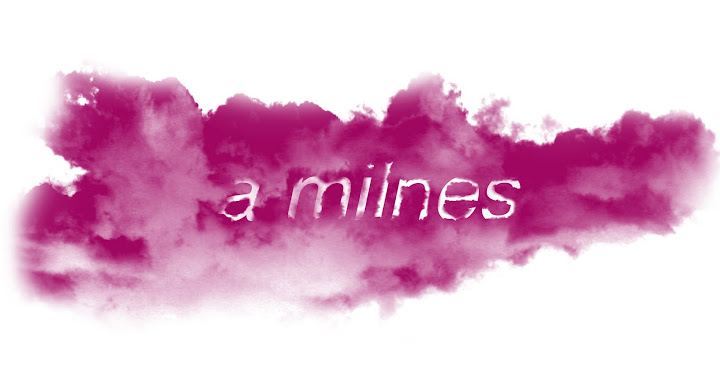
playing around in a name of designing

Do More Good Stuff!
instead of playing in the snow, I took advantage of the mass snow fall to see if it could be used in my project for Lastminute.com, so I delved into my back garden and this is what I produced with a wine bottle in hand....
Tuesday 22 December 2009
ora- not - so - gami


Haha! oh dear I can NOT make Origami for the life of me, trying out an idea for my new project..... looks like its not gonna happen!!!
even was looking at how to for kids!
shameful ........
Saturday 19 December 2009
Holden Gallery Exhibition

Tuesday 15th December
Holden Gallery: Student Showcase.
Last week my friend Sandra became a curator at the Holden Gallery at MMU. And her job is to present an exhibition each month showing students work that they submit to be chosen. It is held in a gorgeous little area in the Gallery, with amazingly tall walls and has a very Victorian-esq style to the room.
I submitted my work for my Don’t Panic Project; this was a collage representing Resistance to Religion. I was proud to see my work up on the wall, as I was unsure of how my design would work, presented.
The Dean showed up at the exhibition as well as our tutors and students from all of the art courses. The opening exhibition was a success and I was very pleased to show my work in the first ever showing.
The images I have showed are of my work, and other students work up at the showcase:
Anna’s book for ‘Silence’. Exploring the silencing of women in surrealism.
My work for Don’t Panic ‘Resistance’ competition.
Betsy’s Silence book, and developing work.
Jon’s book cover screen prints, and Arran’s Don’t Panic ‘Resistance’ poster.
Monday 14 December 2009
ho ho ho the seasons here

I came across this on the creative review webpage, it’s a few good examples of Christmas adverts, well the ones that creative review enjoy anywho. Just wanted to share these with my fellow bloggers as they envelop the Christmas spirit in a witty way.
(“Ding Dong Merrily On High”
Creative review blog)
Yep, in case you hadn't noticed, 'tis the season for tawdry advertising once more. Here, though, is a selection of christmassy ads that made us smile rather than wince, plus some other amusing xmas ad-related paraphernalia...
Neasden Control Centre

Neasden Control Centre
Stephen Smith came to our University last year to give a lecture, I had not discovered Neasden Control Centre before this lecture and was pleasantly surprised.
I am writing about this again as I feel this company is a encouraging group and can provoke people to step over the boundaries of design. He has definitely made me challenge my way of designing and making sure I develop my creative skills.
Steve Smith has been working for many years, his company is in London in a place called Neasden and therefore his company is called the Neasden control centre. It was an exceptionally very interesting lecture and inspired me to start drawing again. I was disappointed that I wasn’t picked to do a workshop with him but it was for people who didn’t really do illustrations or draw so am sure it was so much more encouraging for them.
Neasden Control Centre is Stephen Smith - working broadly across disciplines in creative direction, graphic, installation, film and motion. Since its establishment it continues to develop by hand a raw, layered, collaged, and primal approach while expanding in scope and vision. The mission is always to remain experimental and diverse working closely with clients, curators, galleries and institutions on a broad range of specific print executions, billboards and other one-off projects. NCC has released three monographs/books: Neasden Control Centre (Die Gestalten Verlag, 2003); Smithfield Building (Rojo, 2006); and Lost Control (Die Gestalten Verlag, 2007). Both the 2003 and 2006 books have sold out. Other work includes editioned screenprints, zines and working with universitites / publishing houses on a broad range of exhibitions, public programme's, installations, talks and workshops. NCC has exhibited widely including solo exhibitions across Europe and in Group Shows that include the Spank The Monkey exhibition at the Baltic Centre for Contemporary Art where NCC together with Banksy and David Shrigley were the three invited British artists. As well as regular commissions, NCC has attracted Arts Council of England and British Council support for its projects.
christmas spirit

A ha, I love this image. Found it while googling the words 'had enough'. And this came up, made me chuckle and its christmasy in a abnormal kinda way!
the 00's

http://nymag.com/arts/all/aughts/62525/
The 00's Issue Covers
By New York Magazine
For the cover of the ’00s Issue, several graphic designers were invited to illustrate “’00s” however they wanted. Two were selected for the cover (one for subscribers, the other for newsstand).
This was something I came across while looking for inspiration for my new project, it caught my eye immediately. It interested me because it is building up to 2010, and what we have achieved in the ‘noughties’. New York magazine asked numerous illustrators, graphic designers and artist to produce a design each and for a few months these were the featured front cover designs.
I just wanted to blog about this because I think it is a great idea and celebrates this past decade.
Si Scott

Si Scott
Si Scott is a graphic designer and illustrator who is the driving force behind the UK-based Si Scott Studio. His obsessively hand-drawn pen and ink illustrated typography, graphic design and illustrations pull from both modern and traditional influences. Some of his clients include BBC TV, Burton, GQ, Hugo Boss, MTV, Unicef and Volvo.
Last year Si Scott came to our university to give a lecture about how he and his work has progressed thought-out the years. I had heard about Si Scott in college and I love his style of work and design. The patience and drive he has to create beautiful drawings and type is incredible. He really inspires me to incorporate illustration into design, its so different to most graphic designers and you can see the passion he puts into every design.
He explained his progress and he states he works 90% hand drawn and 10% on the computer but you wouldn’t think it, his work is so precise you would think its made on illustrator, he intimidates me but at the same time is inspires me to branch out.
“Its what you bring to the table”
He works all over the world, mainly in the big apple and someday will move there. His inspiration for ideas can literally come from anywhere even brothel signs….
He does many designs to do with animals and they are so visually stunning, they don’t even need to advertise anything, people have even asked him to design tattoos for them.
His work has meaning behind it as well as beauty, one design he did for Tank Theory was of a animals skull but it was made out of pregnant women, this was to do with voodoo and human sacrifices. It is visually astounding and is my favourite of his pieces.
He has designs a coffee table book that is now shown in MOMA in New York, which to me astounds me and really shows he is worth his salt.
“I don’t like seahorses, there perverts of the sea”
Sunday 6 December 2009
Hamish Muir

Hamish Muir
Hamish Muir was our visiting lecturer today, he showed us his work, his studio and told us about how he formed 8vo and Octavo. His work is very type based and clean cut. He described how most of 8vo’s designs were made by collage and then photographed and re edited. It was an amazing process that he explained. He was very open with what he thought about graphic design and wasn’t scared to say what he thinks.
He met Mark Holt and Simon Johnston at Basel school of Design, together they formed 8vo (named from a meaning for a printing process)
8vo designed a wide range of typographically-based projects in identity, print, publishing, record packaging and information design for clients in the UK, Europe and the U.S. between 1984 and 2001. Clients including factory Records and Hacienda.
http://www.swisslegacy.com/index.php/2007/12/17/interview-with-hamish-muir/
Swiss Legacy:Interview with Hamish Muir
“I am a graphic designer who uses type. I am not a typographer. I happen to use type a lot. But to me ‘communication’ is more important. Typography is only a means to aid communication, not and end in itself”
“in the UK things generally followed a kind of traditional approach and it seemed type was always there to support the idea or image, it never seemed to be the idea or image itself.
So what we set out to do was to make design where type and typography were central to the idea. Where type would be the image. Our influences were from outside the UK; Europe (Switzerland in particular) and the USA (Holt had spent time working freelance in San Francisco). But we didn’t want to copy what we knew – we wanted to develop our own approach which was relevant to the context in which we were working in terms of clients, jobs, purpose and audience.”
Hamish Muir isn’t really my sort of designer, but it was interesting to see his process and how he has made such an impact on designing. He is very much ‘the design process’ and I am more the ideas person so I think we are like opposite magnets in that sense.
From what I learned from Craig Oldham in the last lecture i consider Hamish Muir to be in Bunch A (logical designers)
While I am in Bunch B (emotional designers)
Sarah Hanson

this is by Sarah Hanson, i found this brilliant collage designer on www.debutart.com
She is brilliant and you can see how much thought and effort she puts into each and every detail. Her work is very diverse and is similar to Matin O'Neill. Her work is messy and hands on but still coherent and readable, I have chosen this particular design because it is what I am feeling right now, I think it speaks volumes even though it is simple to look at. One word = Pressure.
the Holidays are coming

ooooo I don't half love the Holidays, and the iconic coca-cola advert is the icing on the cake for me. Who knew that some red lorries with lights on could be connected to christmas, and become The Christmas advert (as well as the M&S ads)
I feel all festive now..... Im going to put my decorations up.....
Thursday 26 November 2009
Craig Oldham Lecture

Tuesday 24th November 2009-11-22
Visiting Lecture Craig Oldham
“this presentation contains foul language, its blunt, honest, opinionated, spoken in Yorkshire, wandering & erm….”
Todays lecture was one of the most interesting lectures of my whole three years of uni. He was funny, interesting and didn’t just talk abut himself and the companies hes worked for he explained how he has got there and how to tackle life outside of the uni bubble. He spoke about there being TWO different types of designers
Bunch A= logical designers
He showed a video of David Carson along side this to state why he was a bunch B. and I think every designer I will look at from now on I will be mentally labelling with A & B.
He also said to be honest, know your strengths, if you cant do something say…
“I fucking cant do grids”
“I cant do web design either”
He explained to us when he left uni the first 12 month he learned things that he couldn’t of at uni, because you have to live them.
Work hard and be nice to people.
Stage 2 Mull the research over
Stage 3 go and do something else, use your subconscious
Stage 4 wheyyy, Idea!
Stage 5 design away
And this is my process I go through with each and every project I get. He made me feel more confident with my work ethic. Which is such a relief …..
Oh before I forget he showed us this invitation he made for his friends wedding combining the names Dave and Claire to form both names in one but looking extremely elegant
I cant find a image of it but it was well designed and a brilliant idea…..
Saturday 21 November 2009
My Love for Martin O'Neill


Martin O’Neill is a UK based graphic artist and illustrator who create unique hand made collages for a wide range of international clients encompassing advertising, design, editorial and book publishing, as well as regular contributions to the UK and US press.
He also regularly exhibits his personal collages, prints and collections and is a lecturer at the university of the ART London.
His process
Martin’s work evolves from a fusion of collage, silkscreen, photography, pain, and photo copies. 15 years of experimental image making has resulted in his unique and instantly recognisable brand of illustrations
Cutitout.co.uk
Debuteart.com
I love this style of design it is beautiful and inspiring, it has definitely inspired me to explore collage more, I think he has pushed me into the right path and I have found my strength. His designs are amazing and so diverse to other collage designers. He is my Favourite graphic artist without a shadow of a doubt.
Friday 13 November 2009
Christmas Light Switch On


Yesterday the 12th November It was the Christmas light switch on in Manchester. I have never been to this event before, which is shocking because iv lived here my whole life...
anyway it was a great event, and the rain even stopped (for once) they had celebrities perform, the likes of Alexandra Burke and Mr Hudson (guy who sang with Kanye West) and the delightful little Hollie Steel from Britains Got Talent sang. As well as these, the manchester choir sang a dance song, which was quite brilliant but odd and the Mayor of Manchester made an appearance. I didn't know that it was made such an event of, but the atmosphere was amazing, all sorts of people went, and it was entertaining for everyone. At the end there was a spectacular fireworks display above the town-hall (even better than bonfire night at Platt fields park) and obviously all the lights were switched on, which was beautiful as ever.
Monday 9 November 2009
Stiff Upper Lip Collage

This is yet another collage of mine, for Silence. This is influenced by the Quintessentially British and how we don't show our feelings, or we don't show them on our sleeves. We bottle up our feelings and emotions and convey them with sarcasm or witty remarks. The quote iv included depicts this feeling brilliantly in my eyes. Tried to make it look dated and worn, don't no whether the tear drop out of the tea pot with an image of a nose and mouth works, but at the time it felt right....
Trapped in thought

This is another of my collages, its an interpretation of being trapped. I have made it so the image of me is trapped inside the picture frame or mirror, however you want to construe it. I feel that this encompasses silence, and conveys emotional turmoil. Maybe the image represents subconscious/inner emotions.
Friday 6 November 2009
Bonfire Night
Bonfire Night

Last night it was Bonfire Night, I love this day of all days, no presents, no panicking just wholesome family fun to be had.
I went to Platt fields Park for the celebrations and it was one of the best fireworks displays ive seen in years. I went to Heaton Park 2 years ago and compare to Platt fields that was a school boy compared to Platt Fields, I swear I jumped outta my skin at least twice just because of the sheer noise!
Unfortunately I didnt get any images of the fireworks (I was too excited at the time) but I did take photos of the fair. It was so colourfull, with tragic 'Wigan pier' music blasting out. I had a great time. It was freezing but brilliant.
Wednesday 4 November 2009
More Silence design work

Just playing around with layout and incorporating type and colour into my design. Very different to my original....flows better I think....

Monday 2 November 2009

This is a collage i have made from my own images, internet image of old lady and mixed media consisting of tissue paper, tracing paper and painted coffee paper. This image is conveying implications that your shadow is your alter ego it has a personality of its own but unlike you, it cannot show its feeling as we do. I am trying to capture a thought, maybe a past life of the old lady. I want to tell a narrative with my work and give people food for thought.
Silence Brief

project for third year. Our own interpretation of silence. Here are some of my experiments and opinions on what silence can be portrayed as in photography and collage.


BLOOMBERG NEW CONTEMPORARIES 2009
From Sat 12 September to Sun 25 October 2009
"New Contemporaries, formerly Young Contemporaries has a long and illustrious history, dating back to the first exhibition of young graduates in 1949. For the past 60 years this annual show has been dedicated to profiling the work of young, new and emerging artists at the start of their professional careers. Through its annual presence, New Contemporaries has identified serious artists from each generation and given them the opportunity to show for the first time. The premise remains the same today.
The selectors for the 2009 edition of the annual show, featuring 47 artists, are Ellen Gallagher, Saskia Olde Wolbers, John Stezaker and Wolfgang Tillmans."
http://www.cornerhouse.org/art/info.aspx?ID=394&page=0


Johnny Hardstaff Lecture
http://www.rsafilms.com/d/rsa/companies/rsa-uk/85
Johnny Hardstaff came to do a lecture today, but I had also seen him the night before introducing ‘Rollerball’ for are Kino4 cinema night.
He was very charismatic and wasn’t as daunting as meeting some other designers he was loud and entertaining as well as a brilliant graphic designer.
He introduced the film and had a little explanation for it.
Then today he came in and the lecture room was Full! Everyone was interested in him and he definitely was very interesting and full of inspiration. He didn’t seem fased by anything and was very open about everything he did, he didn’t have a meaning for everything and said he did it because he liked it.
He is a commercial graphic designer, but he sounded ashamed to say it, he needn’t be when you see his work. It not like the everyday advert about hairspray he takes you on a journey, sucks you into the motion graphics and your enthralled from beginning to end. He said he “Loves and hates Huge Corporations” and you can see this in some of his work, especially ‘the future of gaming’ for Sony Playstation.
He showed us most of his work and I have recognised some, like the Orange advert for more free texts. With paint pouring out of vessels and overflowing to represent : to have more. Simple idea and simple solution.
He has also made a video for Radiohead- Like spinning plates. I had not seen this and it was so strange and mesmerizing with hidden messages and crying babies. I couldn’t even imagine how he thought of this video.
His main message he put across in this fascinating lecture is that graphic design is a weapon and all we are, are manipulators.
Subscribe to:
Posts (Atom)

